Optoma Management Suite
UI Redesign · Remote Management
My Role
Wireframe, UI Design, Interaction Design, Usability testing
Platform
Desktop, Responsive website
Tools
Figma, Adobe XD, Zeplin, Illustrator, Photoshop
Timeline
Jul 2019 - Mar 2021
Team
Renee: Product Designer
Winnie: Lead Product Designer for OMS
Irene: Product Manager
And of course Dev, QA, and all of the Product & Design Team
Introduction
Optoma Management Suite is an intuitive display management solution.
When I joined, Optoma started to move into the software product sphere: launching smart projectors, and adding more features to the built-in app.
With a continuous stream of new features, the application became bloated and confusing. Therefore, we decided to revamp the experience and redesign the interface.
Problem
Here are the key problems we tackle that need to be improved.
Goal
Revamp the experience and redesign the interface that provides IT administrators with an array of options to support daily operations.

Information Architecture
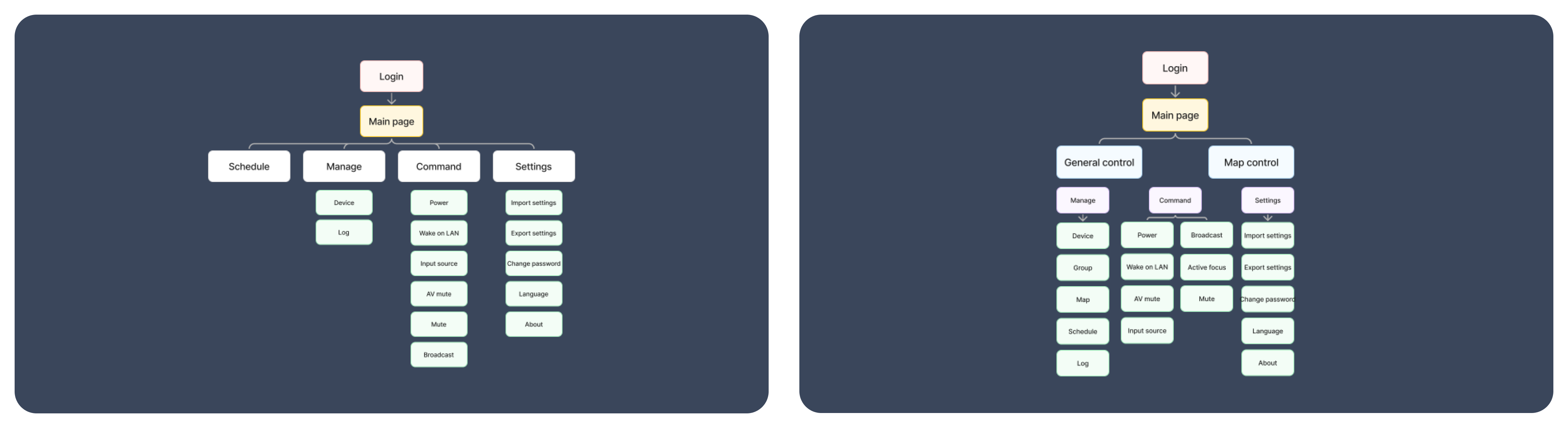
Before
There were huge issues with the main features of the product. Too many small steps to reach the core information, and all the important control features were all apart.
After
Brought important features to the front level of the product and integrated less critical functions for better accessibility and discoverability.
Wireframe
I move onto the wireframe to visualize how each component and visual element should be positioned on the page. It also gave me a chance to think about information hierarchy so I can present the content and function in a more structured way.
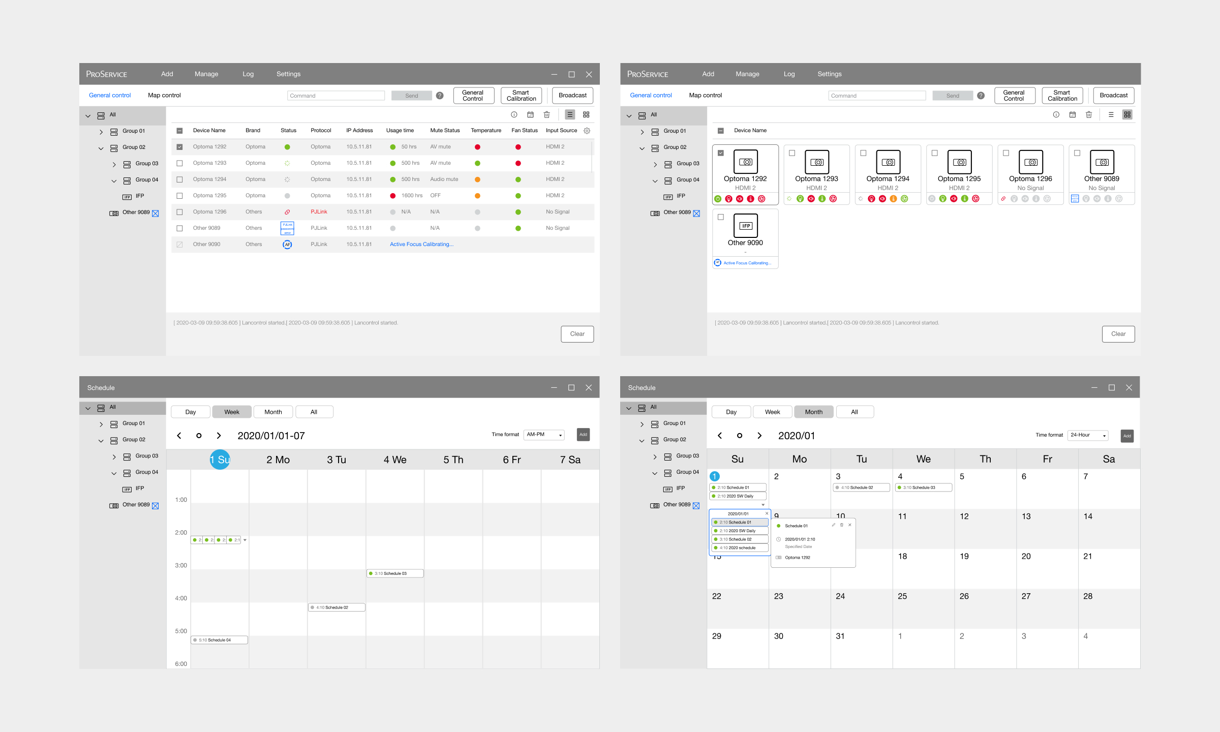
Final Design
Binding devices with efficiency
Finding and pairing the device is a crucial part of device binding, IT administrators tend to bind amount of devices at once and get annoyed if the journey failed and needs to do the process again.
With a step by step instructions and clear information descriptions, the process is returnable and adjustable for unpaired devices.
More constructor way to manage the devices
Device managing and controlling used to be unstructured. It's hard for IT administrators to manage all the devices efficiently.
We extract the key functions from management, then display them on top of the menu in a more structured way to help IT administrators easily skim through them.
Same visual language for better understand
Unclear icon meanings and a broken color system, make IT administrators feel unsure and frustrated to monitor the devices.
I rearrange the color system to align with the brand color and be consistent with the color level. Make sure the icon is readable, and add a hover text description for better accessibility.